Wednesday, March 08, 2006

Fatality, start to finish


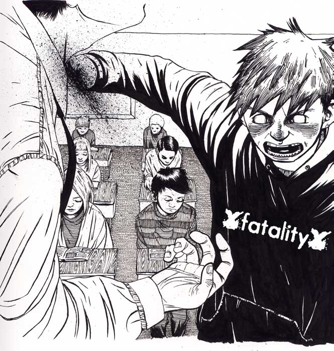
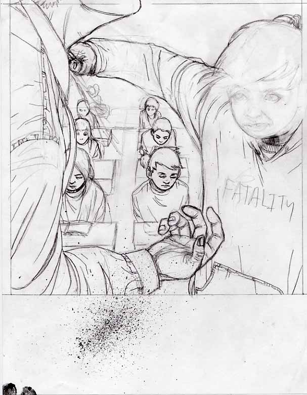
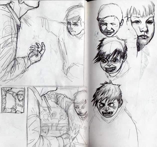
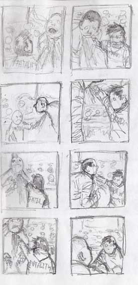
This is the newest illustration. It's a 7" cover for a band called Fatality. This is somewhat unlike my normal illustrations because I didn't have to come up with an idea. The band told me they wanted a classroom with kids reading, then in the front there's a kid with a Fatality shirt on stabbing the teacher in the neck. OK, I said. So I started with thumbnails, I did 6 or 8 of those just working out different compositions and camera angles. Then I picked the one I thought was best and drew it a little bigger. I did this a couple times trying out different ideas. I knew early on that this was going to be a difficult assignment because children are so hard to draw. I also decided I didn't want to use photo reference in a direct way, as I've been doing lately. That's good because I don't know anyone with kids to take pictures of and finding a picture of a kid making a stabbing motion would be very difficult. I figured I had it close enough in the thumbnails so I went to a full sized sketch at about 8". It's always good to do things a little bigger than they need to be so they look sharp when reduced. I arbitrarily chose 1" bigger, some people say 150%. I got really stuck sketching it out. I knew drawing children was hard, but it was going especially badly. Mostly the face, it was so bad and I drew it so many times that I gave up for the night, deciding to come back to it. I drew some children from photographs, studies you might say. I thought about who draws good children and I remembered Deth P. Sun from college. After seeing that and playing some poker with my friends I drew the little face that looks just like the one in the finish. It has a strong anime influence, like Akira, but I like it a lot. I might put him inside a snowman. I normally don't do anything that looks anime/manga so I had a strong sense that this was going to be a disaster. So I took another look at my full size sketch before tracing it on my light table. The face was honestly so bad that it was distracting so I erased it before tracing the image. I couldn't draw the face again because I had erased the area so many times that the thin computer paper was starting to give in, so I decided to do everything around the face and sketch it in on the finish later. I inked it all with a utrecht red sable #2, an untested new brush that I don't really like, and my tried and true Speedball Super Black India Ink. I spent about 6 hours doing the finish, I even got in there with a japanese manga nib (Deleter, I think) and some microns for the intricate work. This was one of those pieces that didn't go well then whole way and suddenly came together in the end, I hate that. The logo is theirs. I added it in photoshop at the end. I wish I could tell you what record label this will be out on, or anything else about it, but I've never even heard them. I know these will be photocopied and will probably be a run of 500.

Friday, March 03, 2006

Belts

Today an English company asked me to design a belt. They're called unchaste (unchaste.co.uk) and they make limited edition designer belts. I'm going to do it, I think it sounds fun! I'll post it when I'm done. *Edit: actually it looks like it's going to be ties, and maybe belts and wallets. we'll see.

Wednesday, March 01, 2006

EMDC


Well I got this one done, so there's only 5 or 6 more record covers to do, and I only need 50 more to make some money so keep 'em coming. I've been getting a lot of people emailing me and they want to know how much I'd charge to do their record cover, or how much to use a painting. I write back and I never hear from them again, but it's not like I ask for a lot. A couple years ago I told a guy I'd do it for $20! Never heard from him again. I've got to learn to ask for more money because I'm never going to make it working for like $3 an hour no matter how fast I get. I had a teacher who gave this advise on pricing: "You add up how many hours you put into it and what you think you should make an hour, then add your material fees etc. Then you take that number and add $500." Well these small punk bands are never going to pay for that, especially if they can't swing $20! Anyway, the idea for this is theirs, a zombie old school skater. I wasn't to keen on it at first but I actually had a lot of fun drawing this! The second image will hopefully be the t-shirt. The logo was not my creation.

Sunday, February 26, 2006

Comic Colors

I colored this drawing quickly on photoshop, just to experiment, and I liked the way it came out. It's mostly experimenting with the blending modes. I think if I have to color my comics in the future they will look like this. It was quick and easy and I like the way it looks. I've done some work using the standard "liquid!" type of coloring and I found it to be tedious and time consuming.

For sale artwork

I've been working on setting up a new for sale section on my website. In the future when you click the "For Sale" link you will instead be taken to this (in progress) blog. I'm working out the paypal business account thing so I can accept credit cards, and there will be a shopping cart function. You'll notice that there aren't really any prices, there will be, on everything in there, but I'm waiting to "debut" the new section until I get my California resale permit this week (hopefully). If you don't live in California it won't affect you. Once again, I can not take credit for this idea at all, thank James Jean www.processrecess.com If you don't know about James Jean you should; he's one of the most talented, prolific, and innovative illustrators around, seriously. I look up to him a great deal. On top of being amazing, the guy at Super 7 told me he's a really nice guy, and he's only like 26, so there you go! Part of me wishes he was a well-known asshole so I could hate him, but that's just because I'm so jealous! There's another guy I found out about through him named Kenichi Hoshine. He is also amazing and you should know about him. I wish that my gallery work looked like his. I don't know if he's a jerk or not, but I hate him anyway with my rampant jealousy!!! HA!!!! He's probably the nicest guy ever and I'll regret having said that one day. Oh, those links are such a strain on the spell-check, grrr.....

Thursday, February 23, 2006

The Stinking Corpse in My Apartment

This is probably finished. I plan to submit it to a group show at the Boontling Gallery called "Overhung 2". The owner is a friend of mine and he always asks me to submit. I didn't feel like any of my newest work was appropriate, mostly because it's all on the illustration side and not good for gallery work, or it's too big for this show, or I don't want to sell it for any small amount (like the tentacle one I'm quite fond of). So here it is. If it doesn't sell at the show I'll put it up here. I want to set up a paypal account through this blog, and on my website. Basically I want it set up the way James Jean has it (processrecess.com). It's a good system. I forget why I didn't get one the other day..... I got a check yesterday that made me laugh. It was for prints and it read "For: Organs and Lobotomy". It could seem weird out of context.

Tuesday, February 21, 2006

Painting

I've still got so much to do. People just keep asking me to do things, and I can't say no or ask for a decent amount of money! Maybe I should get an agent. Anyway, I'm putting down everything else to work on a painting. I was asked to submit to a group show at boontling gallery, and it's got to be done by Sunday. Just a little one though, no sweat. The problem is sometimes when I have a close deadline I draw things that are MORE complicated then I would normally draw, making extra stress for myself. There must be some psychological reason I do that. At least I always make the due date and it looks good. I'm going to try to combine the political zine drawing I'm supposed to do with a painting. There will be no free time or weekends for me until I get frequent and lucrative work; it'll be a while.