Tuesday, April 25, 2006

Tastes Like Chicken

This is for a magazine called Tastes Like Chicken's website. If accepted it will be in the "Pen and Think" section. It's for an article about something called a Command Line which is a theory that says everything in our lives is mathematically dictated. It was supposed to be 3"x5" so I did it on a 3X5 card. You're not supposed to do that, things are always supposed to be shrunk down so they look tighter, but in this situation it works because there's no painting. I drew it using a rapidoliner pen, and letraset letters, then I colored it in photoshop because I think computer coloring looks better on the web than painting. I got the picture of the baby from google images, which I find phenomenally useful for reference. I don't know any babies!

Kitchen sink

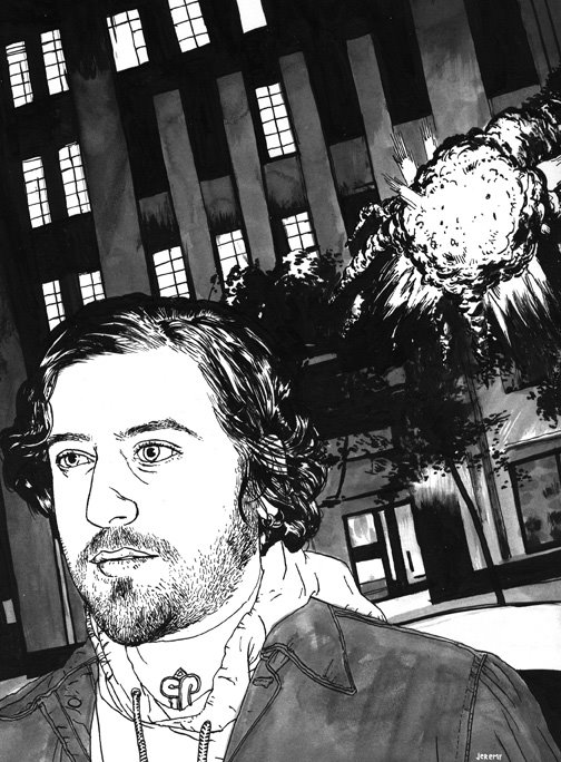
This is an illustration I JUST finished, I haven't even sent it yet. I don't even know if they'll like it, but it should be a full page in a magazine called Kitchen Sink, issue #14. The article is about indie films and talks about how the ending is always the lead character gazing into the middle distance, and it says there should be more explosions in the end. It's a pretty amusing article, although, I'd contend that the reason indie films don't have more explosions is because they're so expensive. I used my usual speedball india ink, a deleter japanese manga dip-pen nib, a liner brush for some of the hair, and a couple normal rounds. I shot the reference with my friend David V. D'Andrea (thanks dude!) on Sunday night, and did the entire thing yesterday, then scanned it, resized and got it print ready this morning (by this morning, I mean 3:00 p.m.). This is my first magazine illustration, I hope they like it.

Thursday, April 13, 2006

Stamp Letters

This is what I did today; I spent all day developing and making these letters. Now I KNEW that they needed to be backwards so that they would print right, I KNEW this...right up until I grew the goddamn things on the rubber, then I forgot until I was completely finished carving them out. There has to be some Freudian reason why I blanked that out, has to be. As I was making these I thought they would look all nice and clean with their little serifs and everything; then I printed them and they looked like the most fucked up letters ever, wtf? Why can I not make anything nice? Everybody thinks my artwork is creepy. I start off with a nice idea is mind, and by the time I'm done with it it looks like this. On the plus side I made some really goddamn dirty letters and I like them a lot. I surprised myself because I thought they would look nice and then I printed them and they looked like pure evil. I used a retarded product called a "roll-on stamp pad inker." It has a nice effect because it doesn't ink evenly like the well functioning stamp-pads of yesteryear; truly a superior product. If you want a page of these for flyers or whatever, drop me an email.

Tuesday, April 11, 2006

sketches


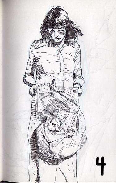
I've been doing a lot of sketchbook drawing lately. I told myself that I wasn't going to do that anymore because I always got all crazy on the drawings and took them to finish, then people would want to buy them and I couldn't sell them. This problem is solved by not working in my book made of thick file dividers. When the paper is able to accept any amount of painting I get anal about it and try to make every page a masterpiece, even painting over old pages I didn't like. I stopped using that book for now and am just drawing in a canson sketchbook of crappy paper, this saves me from myself because the paper does not accept paint at all. #1) I like to draw from old national geographics, especially from the 50's. This one was from the 80's I drew the shark first, then flipped a couple pages and found this hunter and drew him under it. I like the juxtaposition a lot and I'm going to try to convince this band that it would be a good record cover.#2)This is from a Nat. Geo from the 50's. I spelled mustache wrong, but what can you do?#3)Also from a 50's Nat. Geo. The pictures weren't as sharp back then so they provide a little challenge as reference. I like that I can't get all the information I need from the picture because it makes me flex my brain a little bit and improvise.#4) I drew this in the Laundromat today, it's from an 80's nat geo. I thought that kangaroo in a clear sack was kind-of creepy.#5) There was this homeless dude passed out next to me and I drew him in a couple minutes. I could have taken all day, though, because he was passed out stone drunk after someone gave him a roast-beef sandwich that he showed no thanks for. The attendant apparently didn't like that I was drawing him, as if I was somehow exploiting him, and tried to wake him up 3 times. He didn't move one inch; stone drunk. I never do life drawing these days, but I'm starting to see the advantages of drawing drunks passed out. I think you can tell I was a little shaky. I was most interested in his hands.

I got a job doing some illustrations for Ellipsis Magazine. I will be replacing Ben Templesmith, a well known comics artist, because he apparently has a scheduling conflict. It's for a story by a writer named Brian Evenson that will be published in 6 parts. Templesmith is doing the first 3 and I'll be wrapping it up. This means I'll have to do 2 b/w illustrations for 3 issues. I'm getting paid in magazines and ad space, which is OK because it's getting my name out there and I need that more than anything right now. Getting gigs has been exceedingly easy so I'm feeling proud of myself, and I'm told that free is where you start and the money comes later.

Friday, April 07, 2006

Crane

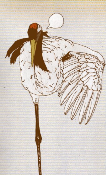
So I've been busy, mostly sketching. I did this sketch and colored it quickly on the computer. I like it, maybe that will be the way I work from now on. It's a lot easier than painting that's for sure. I'd post the other sketches but they're mostly naked girls and Batman. I would think that the former might break some blogger rules and the latter might break some copyright rules. When I do sketches lately it's been all girls because I suck at drawing them. It's fine with reference but straight out of my head it's awful. Monday I sent out 10 emails to magazines and I got 4 responses, all positive. That's great, but they don't pay artists, wtf? Not getting paid is a drag, but I'm still going to do them because I need to get my name out there and to build up a client list. I sent out a second wave today feeling confident about my abilities, but I'm sure that a lot of them went to the wrong people or will never be looked at. One art director told me my work was great and I deserve lots of money; I found it encouraging.

Monday, April 03, 2006

Young Lions


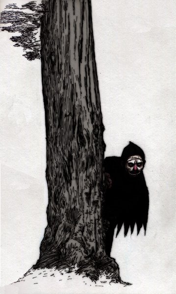
I did my first website for someone else, you can see it at younglionsnv.com I'd like to get some feedback about it. This drawing was a sketch I did in a park on saturday. A group of my friends were in town from Reno and they wanted to go record shopping at Amoeba on Hieght st. They shopped and I went to the park to draw. I thought it would be peaceful but it was full of drug dealers and users. I found a secluded spot and drew the tree, at the end so guys started dealing drugs right next to me, out of all the open areas in the park, so I got up and left. Then I drew the little evil man lurking behind the tree. About 3 years ago a junky (I know because he told me) jumped out of the darkness at me with a gun. It was a powerfully traumatizing experience and since then I've had an aversion to shady characters and a fear that people are hiding behind things. I colored this a little in photoshop, and a little in colored pencil.

Wednesday, March 08, 2006

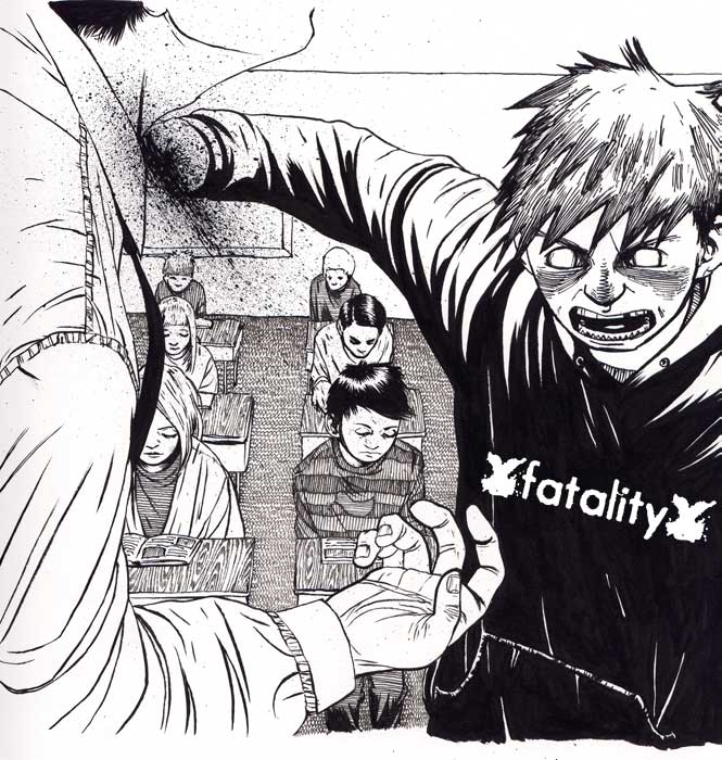
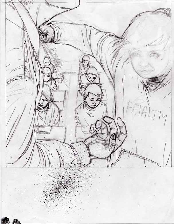
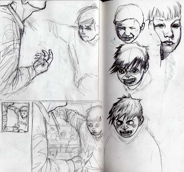
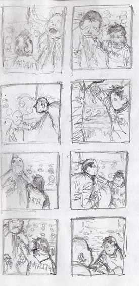
Fatality, start to finish


This is the newest illustration. It's a 7" cover for a band called Fatality. This is somewhat unlike my normal illustrations because I didn't have to come up with an idea. The band told me they wanted a classroom with kids reading, then in the front there's a kid with a Fatality shirt on stabbing the teacher in the neck. OK, I said. So I started with thumbnails, I did 6 or 8 of those just working out different compositions and camera angles. Then I picked the one I thought was best and drew it a little bigger. I did this a couple times trying out different ideas. I knew early on that this was going to be a difficult assignment because children are so hard to draw. I also decided I didn't want to use photo reference in a direct way, as I've been doing lately. That's good because I don't know anyone with kids to take pictures of and finding a picture of a kid making a stabbing motion would be very difficult. I figured I had it close enough in the thumbnails so I went to a full sized sketch at about 8". It's always good to do things a little bigger than they need to be so they look sharp when reduced. I arbitrarily chose 1" bigger, some people say 150%. I got really stuck sketching it out. I knew drawing children was hard, but it was going especially badly. Mostly the face, it was so bad and I drew it so many times that I gave up for the night, deciding to come back to it. I drew some children from photographs, studies you might say. I thought about who draws good children and I remembered Deth P. Sun from college. After seeing that and playing some poker with my friends I drew the little face that looks just like the one in the finish. It has a strong anime influence, like Akira, but I like it a lot. I might put him inside a snowman. I normally don't do anything that looks anime/manga so I had a strong sense that this was going to be a disaster. So I took another look at my full size sketch before tracing it on my light table. The face was honestly so bad that it was distracting so I erased it before tracing the image. I couldn't draw the face again because I had erased the area so many times that the thin computer paper was starting to give in, so I decided to do everything around the face and sketch it in on the finish later. I inked it all with a utrecht red sable #2, an untested new brush that I don't really like, and my tried and true Speedball Super Black India Ink. I spent about 6 hours doing the finish, I even got in there with a japanese manga nib (Deleter, I think) and some microns for the intricate work. This was one of those pieces that didn't go well then whole way and suddenly came together in the end, I hate that. The logo is theirs. I added it in photoshop at the end. I wish I could tell you what record label this will be out on, or anything else about it, but I've never even heard them. I know these will be photocopied and will probably be a run of 500.