Tuesday, August 22, 2006

Blues


So this is some artwork I did for this band called Blues. I'm still in the process of finishing this one up, putting it in the templates etc. It's going to be a digipak CD with a pocket instead of a tray. I've got two versions of the inside, I still haven't decided which one to go with, or if I'll do it pink like the outside....ha, pink on the outside, I like that. It may be a one sided LP eventually which I would be really stoked on because it would show the art so much better. I'm a little obsessed with trees right now. The last CD it was ghosts. I don't really work digitally so this is a change of pace for me, but I like the flexibility. I just realized that the pinks are very different, I'll have to change that. Oh well, you get the idea. To be released on Rome Plow Records, who have been very nice to work with and have an affinity for making quality releases. Yeah, they're cool guys and I hope to do more things for them in the future.

Tuesday, June 27, 2006

Bafabegiya CD


The bafabegiya cd cover is uncropped. Next: Greyskull cd/lp and comic book pages for comic-con.

Saturday, June 24, 2006

Juvinals Record


As soon as these guys from Pirates Press get back to me this will be done. I've emailed them twice and all I need is their goddamn template but they haven't responded. This is a new way of working for me, all little lines of color that add up when mixed by the eye. It comes from impressionism. I like the effect but it was a little on the time consuming side. Every area had to be painted at least 3 times with an opposing mesh of hatchmarks. It's a little tedious. I don't know how commercially viable it is, but Barron Storey does it so it must be possible.

Tuesday, May 09, 2006

Ghosts

This painting is for a themed group show called "Wizards and Warriors" that is to be in L.A. I guess it's pretty orthodox as far as fantasy goes, I didn't really try to stretch the boundaries like "what is a wizard, really?" I was thinking a lot about Ash Wood and Frazetta when I painted it. I really like the way it was painted, it's more "painterly" than most of my work and I had a lot of fun making it. It was nice to make something where I could just be silly and not have to worry about it being brilliant. If I just made covers like this for metal bands it would take a lot of the stress out of coming up with a good concept.

Thursday, May 04, 2006

Ellipsis magazine 1


These two will hopefully be published in an upcoming issue of Ellipsis Magazine. I got a job doing web design, and I start in about 10 days. I will have to get up at 7 for this job so I started today so I can get used to it. I emailed this art director at about 9 and I got impatient so I just started and finished the illustrations, even though he still hasn't approved the sketches. If he doesn't like them for some reason, I'll just do something else.

Tuesday, April 25, 2006

Tastes Like Chicken

This is for a magazine called Tastes Like Chicken's website. If accepted it will be in the "Pen and Think" section. It's for an article about something called a Command Line which is a theory that says everything in our lives is mathematically dictated. It was supposed to be 3"x5" so I did it on a 3X5 card. You're not supposed to do that, things are always supposed to be shrunk down so they look tighter, but in this situation it works because there's no painting. I drew it using a rapidoliner pen, and letraset letters, then I colored it in photoshop because I think computer coloring looks better on the web than painting. I got the picture of the baby from google images, which I find phenomenally useful for reference. I don't know any babies!

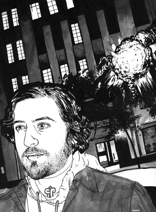
Kitchen sink

This is an illustration I JUST finished, I haven't even sent it yet. I don't even know if they'll like it, but it should be a full page in a magazine called Kitchen Sink, issue #14. The article is about indie films and talks about how the ending is always the lead character gazing into the middle distance, and it says there should be more explosions in the end. It's a pretty amusing article, although, I'd contend that the reason indie films don't have more explosions is because they're so expensive. I used my usual speedball india ink, a deleter japanese manga dip-pen nib, a liner brush for some of the hair, and a couple normal rounds. I shot the reference with my friend David V. D'Andrea (thanks dude!) on Sunday night, and did the entire thing yesterday, then scanned it, resized and got it print ready this morning (by this morning, I mean 3:00 p.m.). This is my first magazine illustration, I hope they like it.